Source: Aloha Airlines Route Map, airlineroutemaps.com, accessible at http://www.airlineroutemaps.com/USA/Aloha_Airlines.shtml, 8:23 pm, Oct. 3rd, 2010
This is a Los Angeles freeway map. This map shows the greater Los Angeles region and the freeways that are in it. I find it interesting because of its simplicity yet usefulness. All of the freeways are clearly demarcated by number and name (405, San Diego Freeway, for example). The differences in colors between the land, water and roads makes this map very easy to read. Some place names are shown, such as Santa Monica, Downtown, and Long Beach for points of reference, but not too many as to make the map overwhelming to read.
Source: Los Angeles Freeway Map, gocalifornia.about.com, accessible at http://gocalifornia.about.com/od/calamenu/l/bl_la_freewaymap.htm, 9:00 pm, Oct. 3, 2010
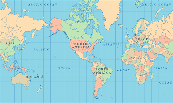
This is a political world map. It shows all of the continents (besides Antarctica) and the countries within them demarcated by color. However, only the names of the continents and the oceans are labeled. Note that the continent name of Australia is not written, as it has been changed to be Oceania to include all of the pacific islands in the region. Here are a few things I find interesting about this map: for one, like I mentioned, Antarctica is not even shown on this world map. I assume the reason it is not on this map at all is because it is not a country, as are all the other places shown. Something else I find interesting about this map is its use of grid-like latitude and longitude lines. Because the lines are drawn straight up and down, the map has to be adjusted for it, making the land masses near the poles look much larger than they really are. Greenland appears to be of the same size as Africa, while in reality it is much smaller.
Source: World Map, world-atlas.us, accessible at www.world-atlas.us, 10:07 pm, Oct. 3rd, 2010